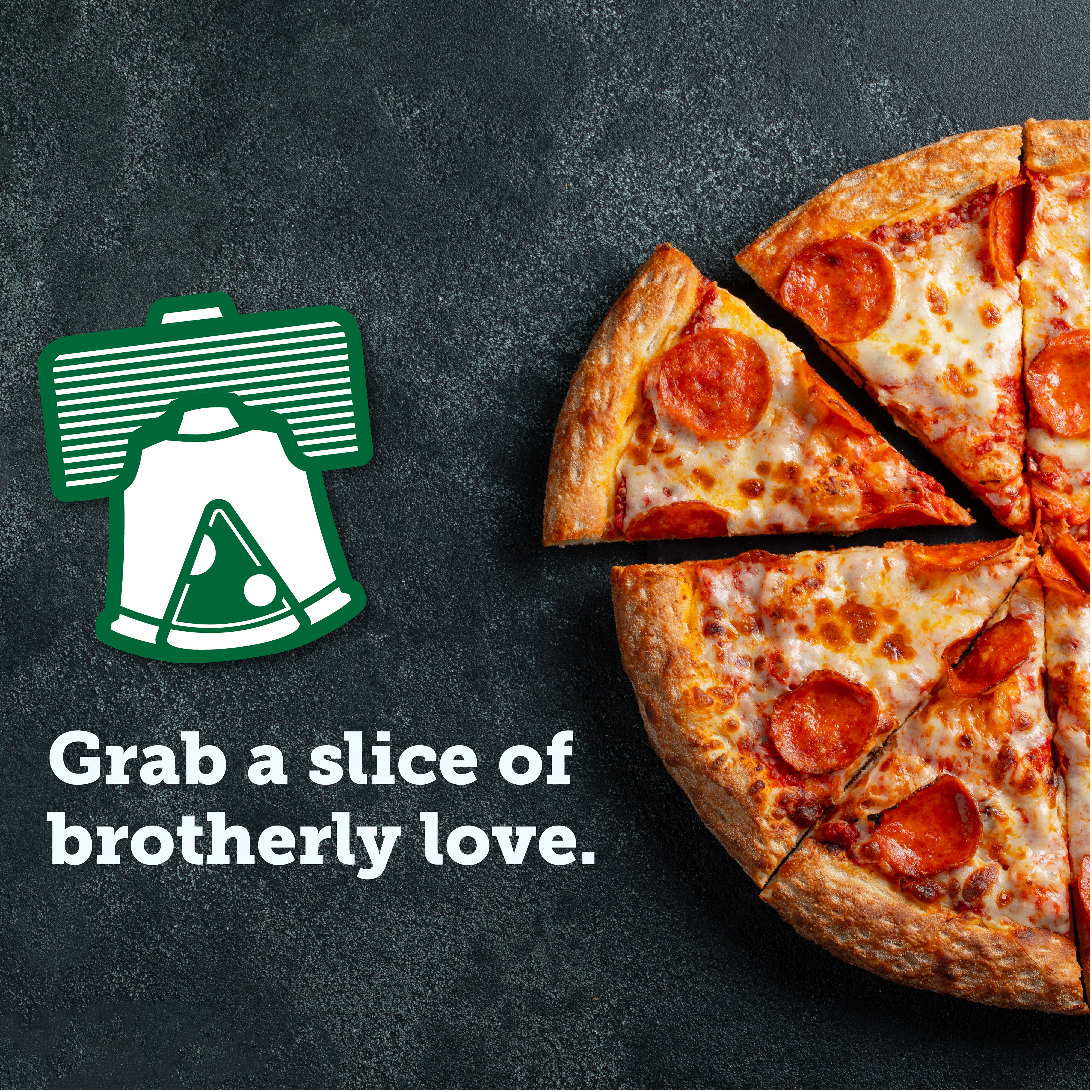
For this brand identity project, the client wanted a logo and visual system that captured a warm, nostalgic, and community-focused feel. To bring this vision to life, I designed a concept deeply rooted in local pride, drawing direct inspiration from the cultural icons of Philadelphia to deliver a brand that truly feels like "a slice of brotherly love."
The Design Details
The primary mark functions as a cohesive, layered emblem, seamlessly merging several distinct Philadelphia hallmarks into
a single, recognizable shape:
• Civic History: The overall structure of the logo is anchored by the silhouette of the iconic Liberty Bell.
• Local Grit & Legacy: The top of the bell integrates the horizontal ridges and form of a boxing glove, paying homage to Philly's legendary boxing heritage.
• The Perfect Slice: A clean, modern pizza slice is cleverly carved into the negative space at the center of the bell, instantly establishing the brand's industry.
• A Nod to "LOVE": The bold, slab-serif typography and the supportive brand patterns evoke the nostalgic, blocky charm of Robert Indiana’s famous LOVE sculpture.
The Result
A cohesive and versatile branding system that stands out on storefronts, social media, and packaging alike. By blending civic pride with retro-inspired design, the brand establishes an instant, heartfelt connection with the community it serves.
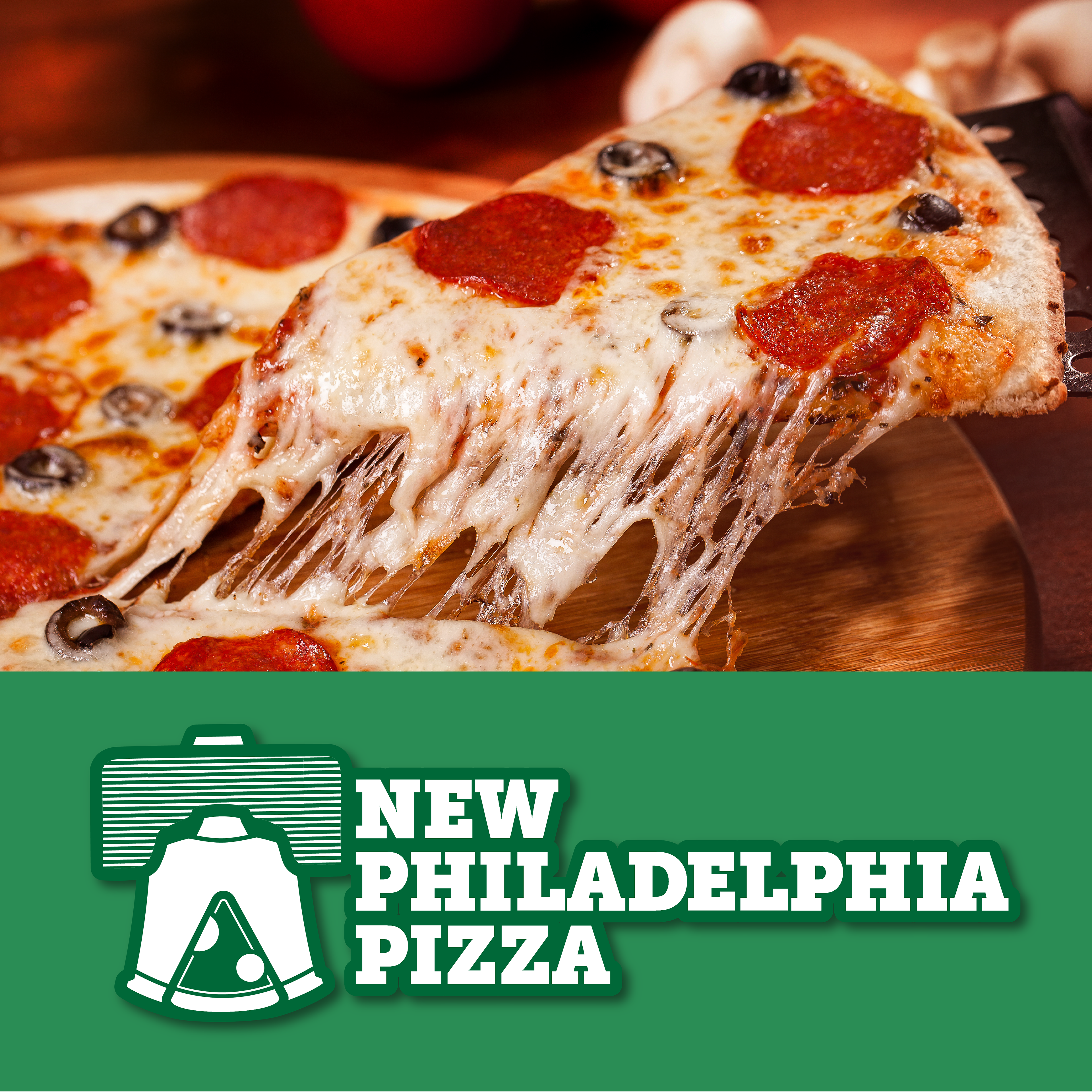
Main Logo
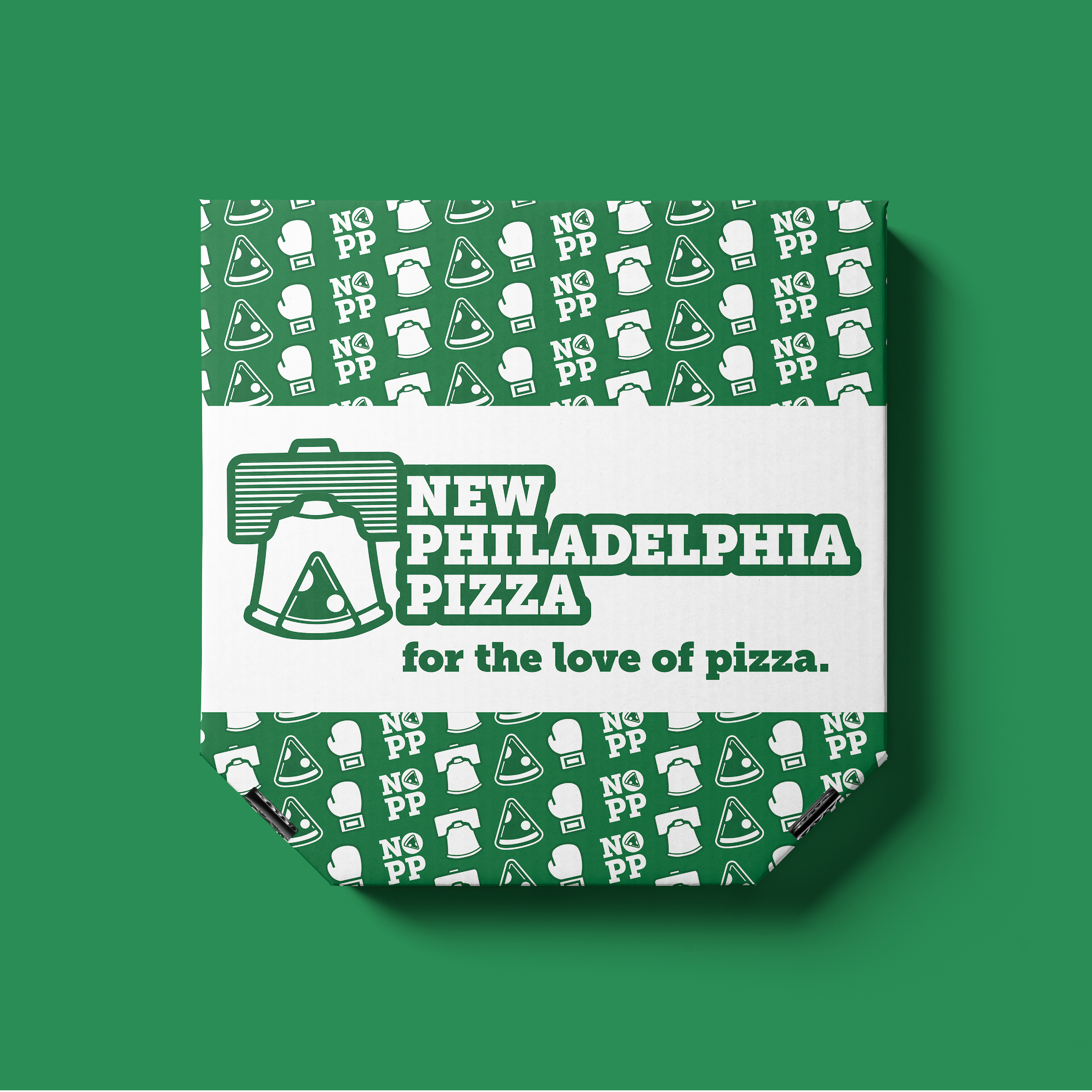
Pizza Box Mockup with Pattern
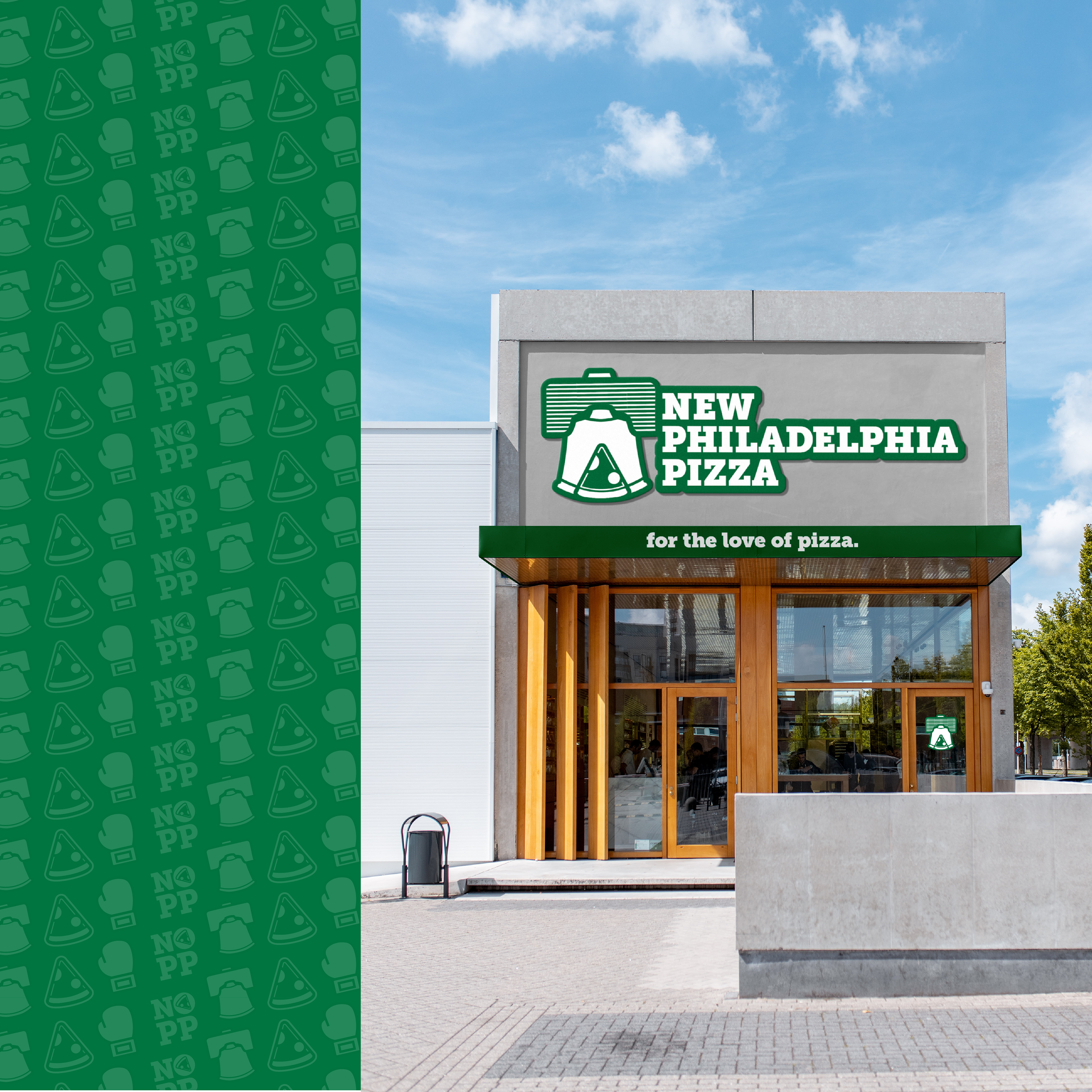
Storefront Mockup