This project is a complete editorial redesign of ProFootball Magazine. The original publication, despite its name, relied on cluttered, tabloid-style layouts rather than the premium, athletic aesthetic expected of a sports magazine. My goal was to elevate the publication into a modern, authoritative sports chronicle through strategic typography, dynamic image treatment, and clean grid systems.
The Design Details
The redesign establishes a high-impact visual hierarchy that balances energetic action photography with structured, readable editorial layouts:
• The Masthead & Cover: Reimagined the cover with a bold, heavy sans-serif masthead that anchors the page. The cover feature utilizes dynamic action photography accented by energetic visual overlays and sharp, high-contrast cover lines to instantly grab attention on a newsstand.
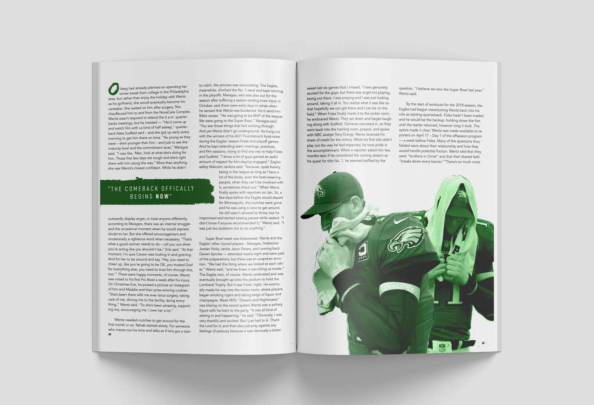
• Editorial Spread Layout: Replaced the chaotic tabloid style with a clean, flexible multi-column grid for the feature stories. This structure allows for a sophisticated balance of dense sports journalism text and large-scale imagery.
• Team-Centric Visual Themes: The design adapts contextually to the team being featured. For the "Comeback Kid" spread, the layout integrates Philadelphia’s iconic skyline and a desaturated Eagles logo into the background, tying the entire feature together with a signature kelly green accent palette.
• Typographic Hierarchy: Implemented aggressive, expressive display typography for article titles (like the textured, high-energy headline font) paired with highly legible body faces and structured pull-quotes to keep the reader engaged.
The Result
A premium, sports-centric editorial system that treats the subject matter with the prestige it deserves. By stripping away tabloid clutter and introducing purposeful grid structures and bold typography, the redesign transforms ProFootball into a compelling, visually immersive reading experience for passionate sports fans.
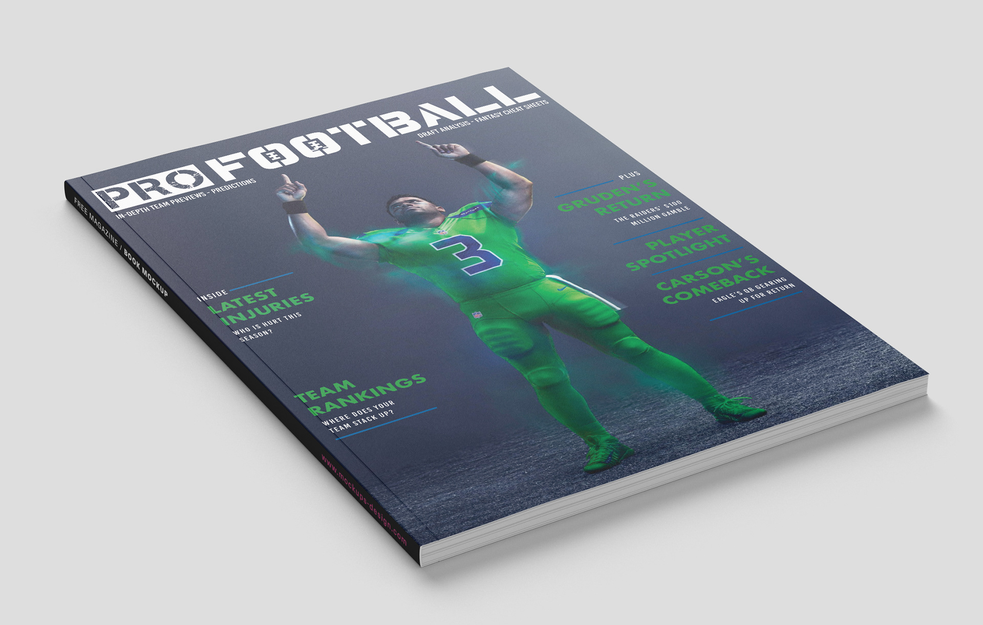
ProFootball Cover
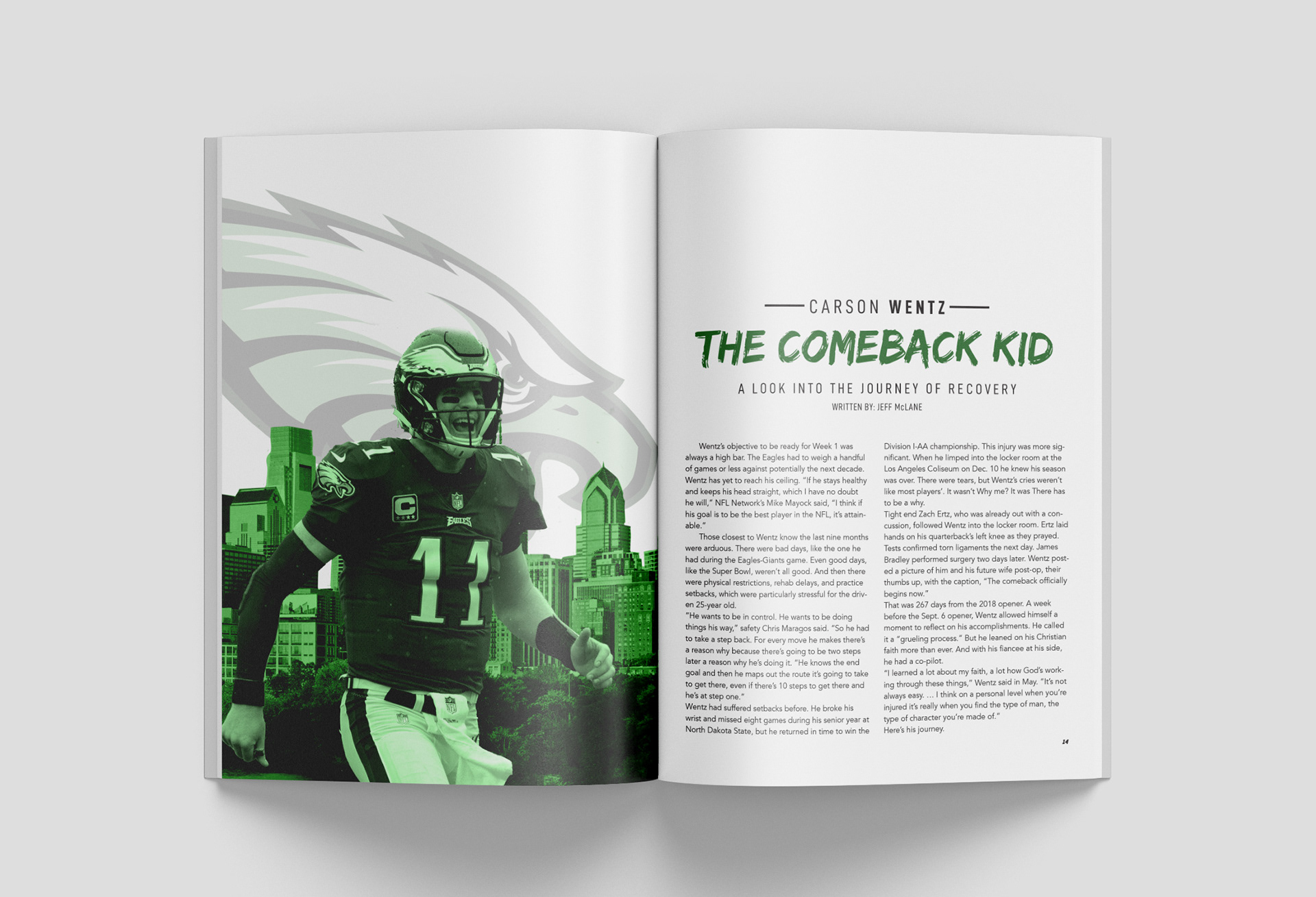
ProFootball Feature Spread